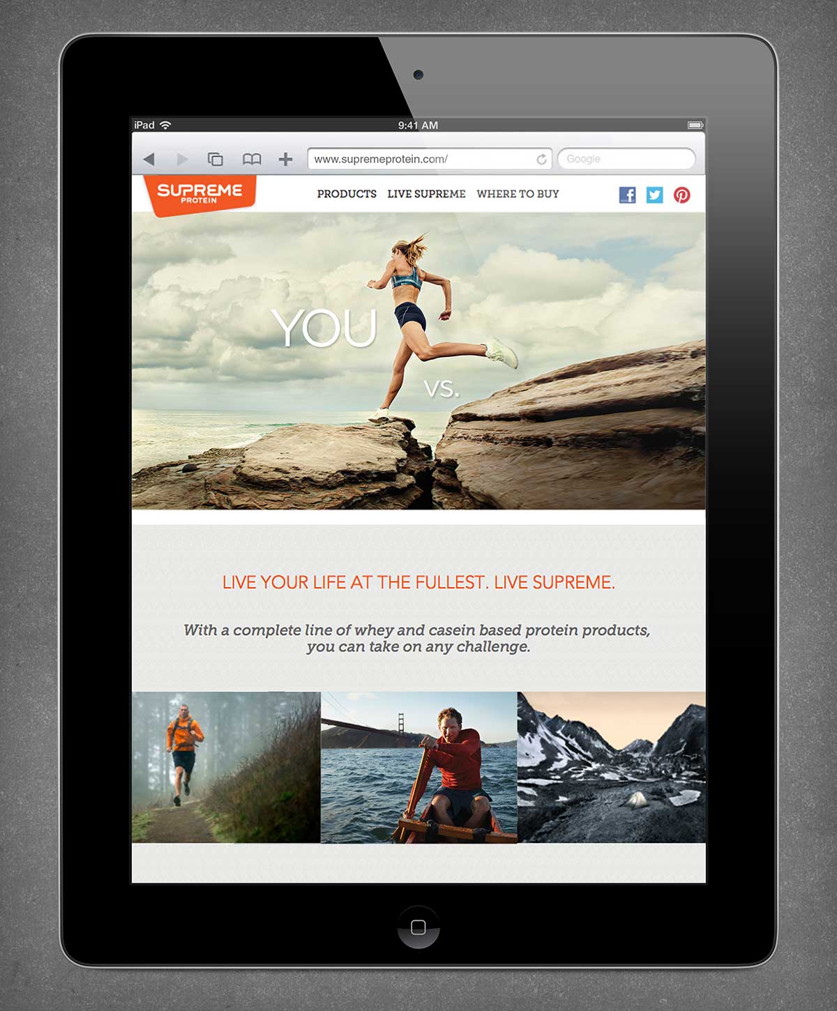
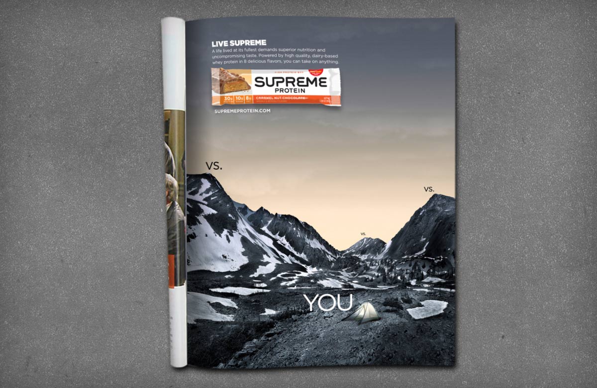
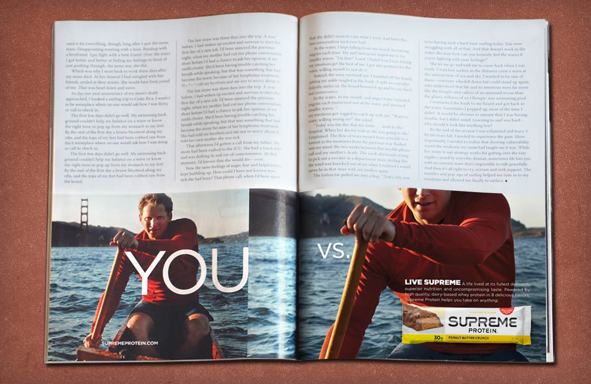
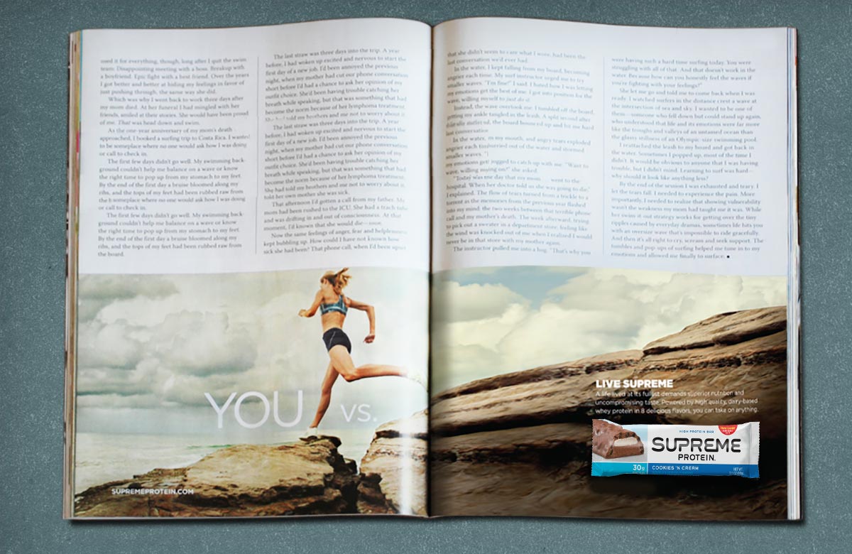
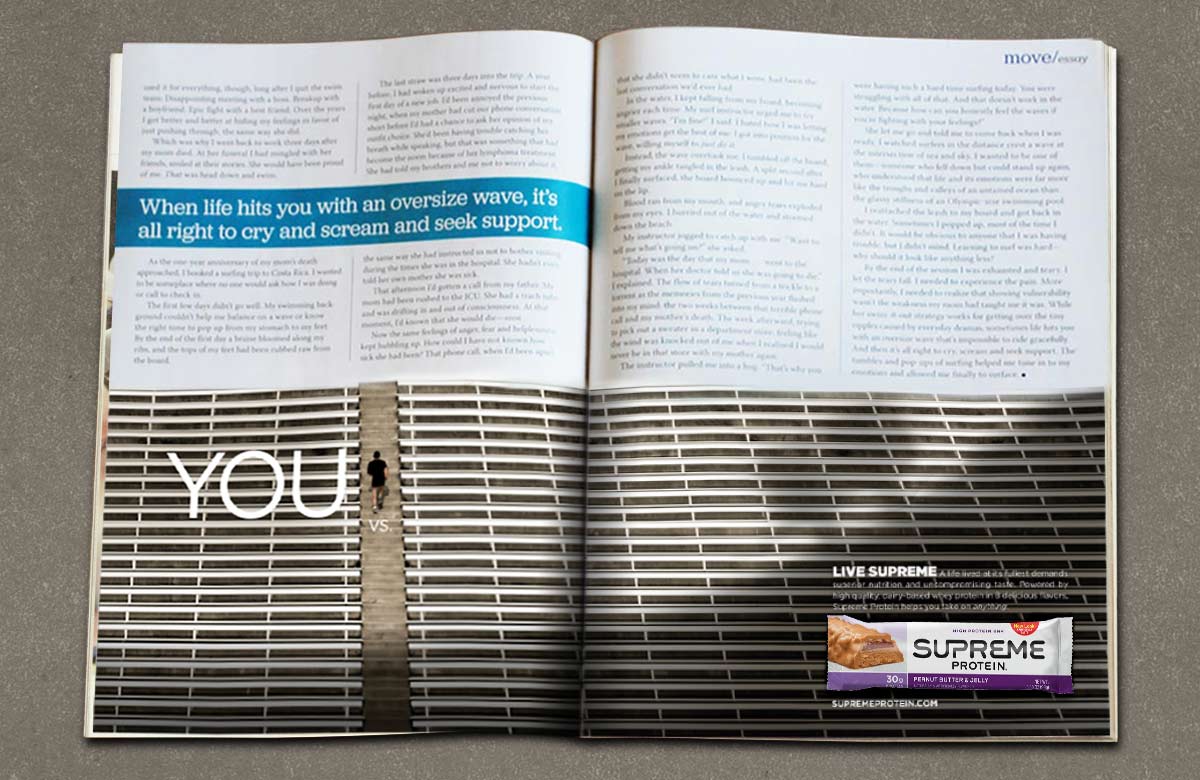
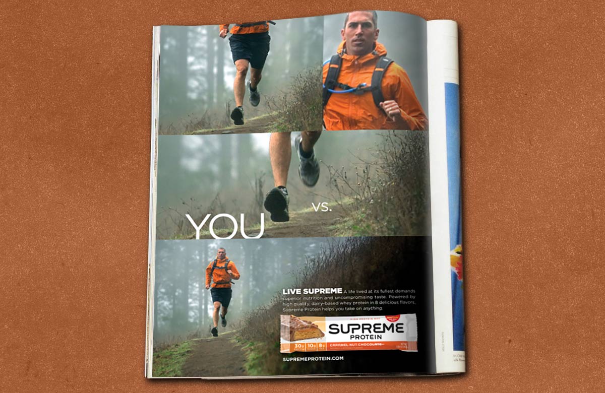
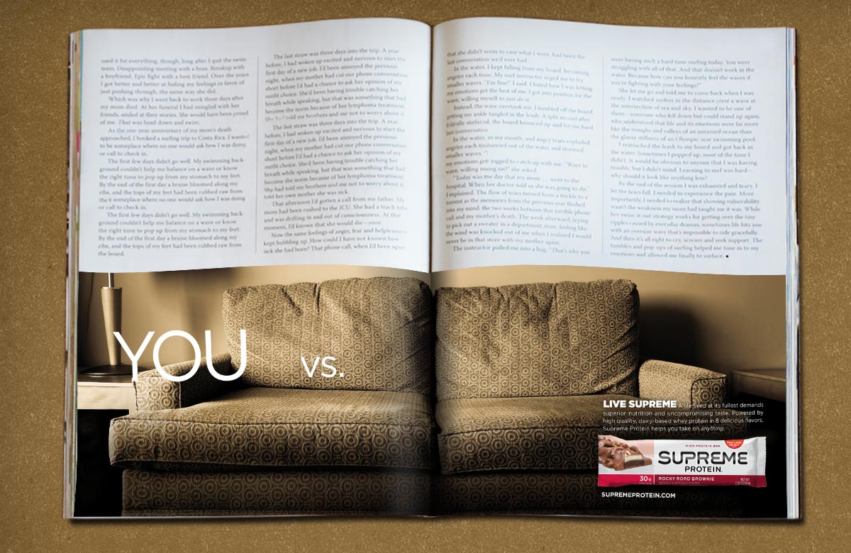
There’s a “vs.” that all of us are up against. You vs. that wedding dress you want to get into. You vs. the track that keeps calling you or that clock that goes off at 5 am. You vs. one more rep or a climbing wall that works with its friend gravity to keep you down. You vs. the early morning bike commute or the after work workout that you would love to skip.
Supreme Protein helps you with pre-workout energy and post-workout recovery. This “YOU VS.” campaign made it clear that, while the product is important, the real hero is you. Using real people and real workout situations, we made a campaign that struck a chord and propelled the brand to success because it truly stands out in the sea of “oiled bodybuilder” sameness. That’s what our VEER Philosophy is all about.
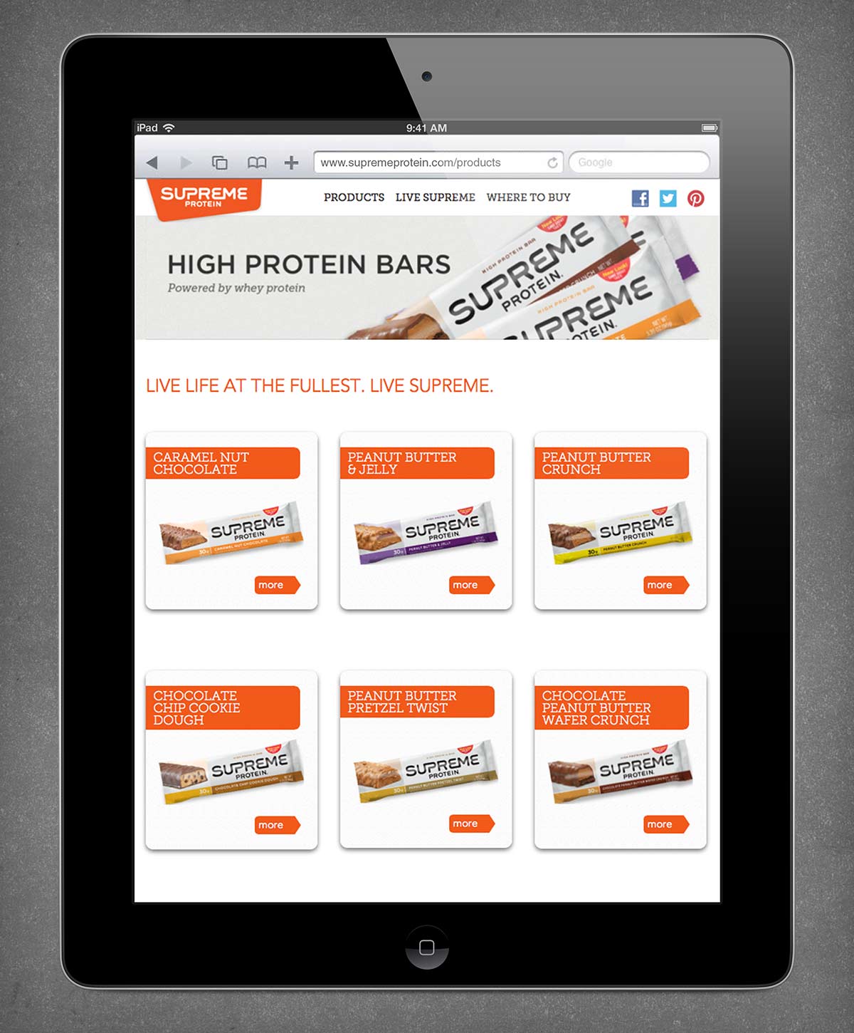
The Supreme Protein website was in dire need of an overhaul to match the brand’s new positioning and look. The site’s dark, heavy colors and clunky navigation was outdated and originally designed to appeal to the male focused, active and athletic segment. The design was built around the consumer; one that not only matched the fresh new look of the brand, but also intuitively matched the needs and behaviors of their image-focused, health-conscious audience. The rebuilding of the site’s architecture from scratch, with a clean and simple UI, allowed visitors to immediately access priority brand messaging, then easily navigate to other site areas to learn more about Supreme. To maximize visitation time, engaging and informative content was created for each page, and intuitively linked sections to Supreme’s social media hubs; ultimately creating a rich, interactive experience and community space directly on their website.
